Land On The Perfect Strategy for Landing Page Creation
What is it that we love so much about a perfect landing? At the Olympic Games, the crowd goes wild when one of the athletes is said to “stick the landing.” On some flights, passengers break into applause when the pilot touches down. Perhaps one of the most famous landings of all time occurred some fifty years ago as Mission Control in Houston burst into wild applause upon hearing the words “The Eagle has landed” as the lunar module safely landed on the moon’s Sea of Tranquility.
Hard work, determination, experimentation, knowledge and technical know-how often go into crafting the perfect landing in the real world, and the same should be true in the marketing world. Although many people think of a landing page as any generic page on the website, or even as the home page, a proper landing page serves a particular marketing purpose, and a great landing page can be the beginning of a long and beautiful relationship.
What Is a Landing Page?
A landing page is a place of action. Many are crucial components of lead generation strategies. Their purpose is to quickly capture visitors’ attention, pique their curiosity, and motivate them to take the desired action, such as filling out a form to receive further information. All achieved in the blink of an eye - usually in just eight seconds or less.
Often a landing page exists purely to capture an email address which will serve as the basis for a well-considered relationship-building plan. Sometimes the goal is a webinar or seminar sign-up, or to encourage the purchase of a specific item at a special price. For the page to be successful, it needs to have only one goal and must be very clear about what it is asking the visitor to do.
“Landing pages with multiple offers get 266% fewer leads than single offer pages.”
- Wishpond
Generally, there is no sidebar, navigation bar or footer on a landing page. The essential elements include a headline and a call-to-action, along with some visually brilliant graphics.
There are many types of landing pages within this basic framework, but they all serve to meet a singular purpose. The most common is the squeeze page, or lead capture page, where the visitor is prompted to provide an email address in exchange for receiving a white paper, e-newsletter or some other type of benefit. A splash page, on the other hand, might not ask for an email address at all but is an intermediary step on the way to another page. These are most often seen when somebody wants to read an article but is first directed to a page that provides a significant piece of news or information.
Some landing pages are linked directly to a paid online advertisement, or Pay-Per-Click (PPC) campaign. These would be the same for all visitors, match the copy of the ad itself, and provide information on one specific topic or buying opportunity. There is also the possibility of directing potential prospects to a personalised landing page, with dynamic content such as name and other more individualised information. In some cases, even the dreaded “404 error” can be turned into a viable landing page that offers alternative searching opportunities in place of a dead end. If the visitor has arrived in search of an offer that is no longer available, the offer ended page should redirect the visitor to another website page or ask for an email address so they can be informed of upcoming opportunities.
The type of page chosen depends on your campaign goals, along with an understanding of the specific audience’s needs and motivations.
How To Create A Landing Page
“Do you have what I want? Why should I get it from you?”
― Tim Ash, Landing Page Optimization: The Definitive Guide to Testing and Tuning for Conversions
The person building the landing page has the responsibility to fully understand the prospect persona, define goals for the page, and create a visually appealing presentation that will accomplish those aims. If the page does not fulfil its mission, testing different versions with amended elements will help to increase page effectiveness. Here are some landing page best practices that help ensure the perfect landing:
Set a goal for your landing page
If you don’t have a purpose, how will you know whether your landing page is successful? Is the goal to provide information, promote lead generation, increase webinar attendance, or to attain a particular sales conversion rate? Defining a purpose is the basis for every decision that is made going forward, from design and font size to word choice and expected response.
Create a clear call to action
Know what you want the page visitor to do and then ask them to do it! Far too many landing pages fail due to a weak or even non-existent call to action. Tell your visitors if you want them to sign up for something, watch a video, subscribe, or ask for information you want and then make it easy for them to supply it. High converting landing pages use noticeable buttons, simple forms and unambiguous phrases such as add to cart, order now, subscribe here, let’s get started, talk to us now, or other action words so that they leave no doubt about what is expected. Make visitors think they will be missing out on something great if they don’t act right now. Provide persuasive social proof such as mentioning the number of people who have already gone ahead build trust, and you can eliminate further barriers by offering a free trial.
Make your copy clear and concise
A landing page is not the place for artfully describing every feature or benefit of your product or service. You want to narrow your focus down to one compelling goal, and then become laser-focused on delivering captivating copy that carefully and creatively drives the visitor towards that goal. The headline at the top of the page needs to be persuasive, there should be a great offer, and the experience should be personalised with dynamic content that speaks to the individual lead whenever possible.
Keep the form simple
People are reluctant to provide in-depth details on the very first meeting, so resist the “gotcha” temptation to think this is your opportunity to gather every single piece of information about your prospect. You could quickly drive a prospect away by making what should be a simple lead capture form overly intrusive or turn it into something that feels like an interrogation. A marketing automation platform with integrated CRM allows you to use a strategy known as progressive profiling. In this instance, you ask only for the data you need to accomplish the task at hand on the landing page, and then slowly gain additional information as you build a relationship with your lead over time. You have probably seen this in action yourself as a user. When you return to a website to download additional resources, for example, you might be asked to fill in a contact form with different fields requesting new information.
Don’t diminish design
While much of this seems to focus on words and forms, you need to incorporate these elements into a graceful and artistic design that appeals to the user. Use graphics, colour, and white space to draw attention and make words pop off the page. A picture is worth 1000 words if it can be used to tell your story effectively, and Eye View Digital says that using videos on landing pages can improve conversions by 86%. Be sure to remove navigation elements that can detract from your singular purpose, but do include trust-building components such as a testimonial or industry certification.
Trot out the tests
We all like to think that our approach is the best and that everything is spot-on correct the first time through, but that is seldom the case. Landing page optimisation requires constant A/B testing and tweaking, where you are comparing options one against the other. Don’t get so set on one element that you continue to use it even though it is not delivering the conversion rate optimisation you desire. Compare and contrast such components as different headlines, images and body copy to learn which increase conversions. Try out an alternative approach to your call to action to determine which one generates more response. Look at the tiniest of details such as font type and size, and even the background colour, to make sure everything resonates with your specific target audience.
Design the entire customer experience
The landing page is an important step, but make sure that the subsequent page in the funnel is just as well designed so that it delivers a sense of achievement for doing a great job. A follow-up email must be just as thoughtfully designed, and can further reward and engage a customer by offering case studies or advice on how customers have used your b2b products, inspiring them to get the best out their new relationship with you.
Finally, you must remember to optimise your landing page for mobile devices. So many users access the web via smartphones and tablets that you could easily turn away a large chunk of your potential audience merely by not providing a good user experience in the format they utilise most. In 2018 over half of all worldwide web traffic originated from mobile devices, but Adobe Blog reveals that only half of the landing pages are optimised for this purpose. Don’t miss out on communicating with half of your potential target base.
What Makes An Excellent Landing Page?
Those are the why and how of landing pages, so now let’s look at some outstanding B2B landing page examples in action. What you see here may not be what they are using now, though, as these companies are certainly doing A/B testing to keep their pages functioning at the highest possible levels.
LYFT
Always on the lookout for new drivers who are interested in starting their own driving business, Lyft hits hard with the earning potential. They make a simple statement and then draw the viewer in with a “see how much you can make” calculator. The application form looks quick and easy. The critique here, or the element worth more testing, might be the decision to incorporate distracting navigation elements such as the blog and partners tabs.
Optimum Energy
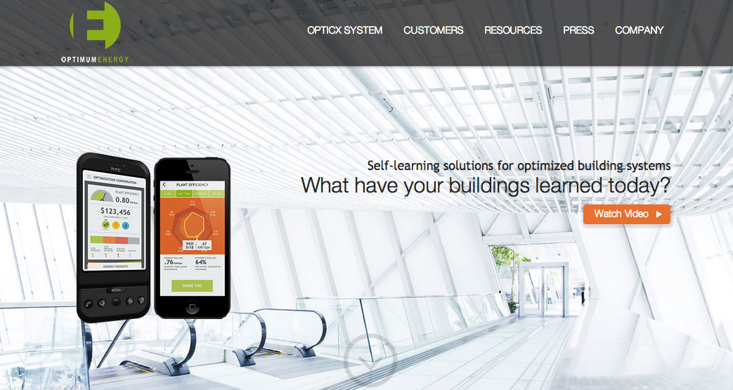
Who knew their building could be smarter? It’s a brave new world in energy solutions, and Optimum makes it seem simple. A stark question and an invitation to watch a video are the only elements needed to draw the visitor into a new adventure. Perhaps a different background could be tested, or some brief examples of smart solutions might be in order.
Microsoft
This is one company that knows how to hit home just by throwing the words “advanced cyber attacks” and “intelligent security” into their headline. This e-book offer gets potential readers interested with chapter headings that cover everything worrisome in the world of cybersecurity. They might want to make their Microsoft logo more prominent because of the name recognition factor or test different backgrounds that call more attention to the cyber danger.
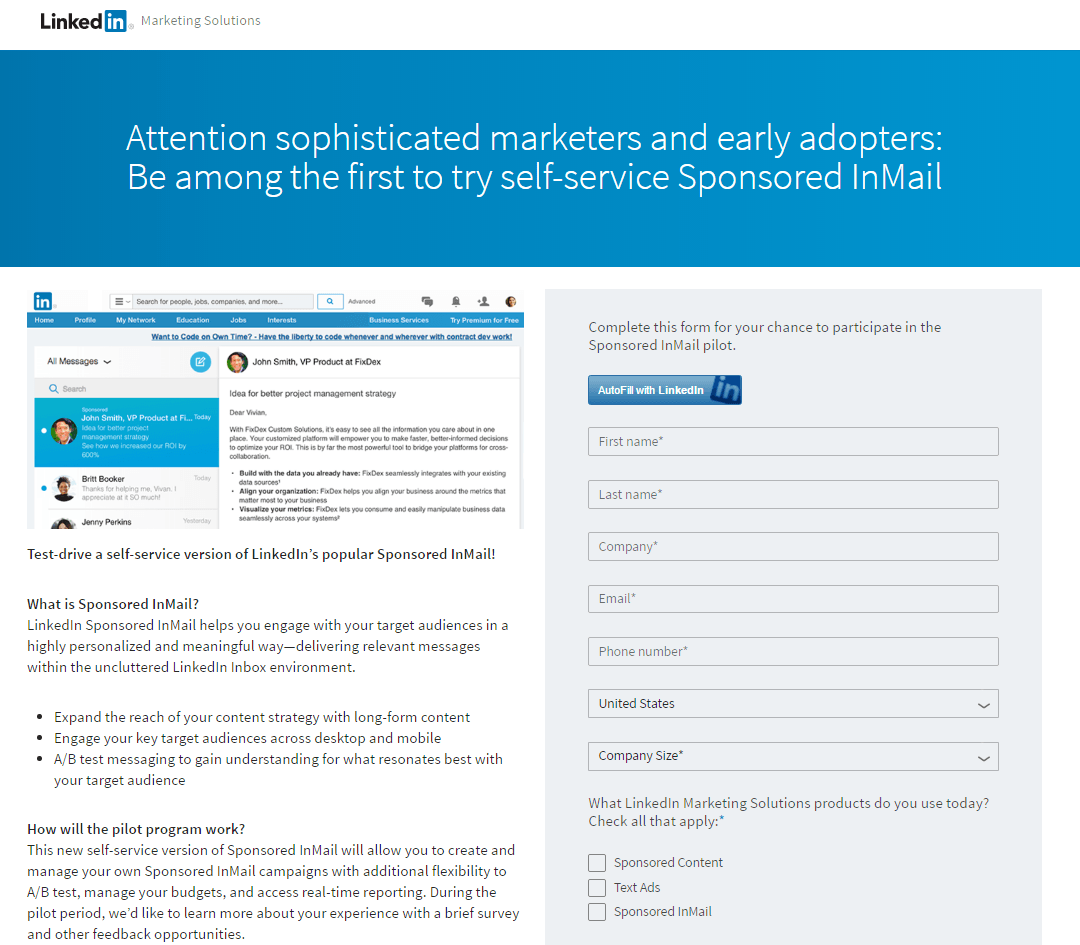
LinkedIn provides an excellent example of a long-form B2B landing page. It starts with an appeal to the ego – who doesn’t think they are a smart marketer? Then it reels visitors in with the promise of being one of the first to try something new. Because this is a new program which requires some explanation, they present the copy in small, digestible chunks. The form may seem a bit daunting, but it does have the LinkedIn autofill option. Perhaps a little more use of colour or sharper images would make this page pop even more.
The landing page might seem like the endpoint of a brilliant marketing campaign but it is better to think of it as a pivot point in getting your prospect to take the next crucial step on the path to success. Make it catchy, make it personal, and make it compelling. Are you ready to stick the landing and find the right landing page strategy that will propel your business or organisation toward higher levels of marketing success?


To meet escalating demands, B2B marketers must transform their approach, ensuring every activity contributes directly to customer satisfaction and business performance